
Collaborative Post
Colours are crucial to how we perceive the world. For example, a light blue sky evokes a sense of happiness, while a grey sky can make you feel miserable, and the same rings true for colours in your bedroom and every space in your home.
Your bedroom needs to be relaxing because it’s your most personal space. If your bedroom doesn’t calm your mind and give you positive energy, where else are you supposed to wake up happy and ready for the day ahead?
The simplest way to make your bedroom more relaxing is with cheerful colours, but it’s easy to get the balance wrong and add too much of something.
Here’s how to design your bedroom colour scheme for relaxation:
Use relaxing colours
These are the best colours for relaxing the senses:
- Blue: Soothes the mind and reminds us of the ocean and sky
- Pink: A refreshing, cheerful colour associated with love
- Violet: Promotes space, calmness and evokes a sense of summer
- Green: Connects us to the outdoors and evokes a sense of nature
- Yellow: Reminds us of sunshine, evoking a sense of happiness
What’s the most relaxing colour of all?
Blue is a very restful colour because it’s fresh and clean. We recommend pastel shades of colours to keep things light and airy, but you could go for a bolder colour on feature walls.
Pick complementary colours
Your bedroom needs a colour scheme, not just one colour. For a relaxing bedroom, your colour scheme needs to be easy on the eye. A primary and secondary colour will guide your design choices, with a third colour for accents.
Here are a few relaxing colour schemes to try:
- Mint green and grey with a blue accent
- Midnight blue and pink with a yellow accent
- Beige and espresso with a cobalt blue accent
- Yellow and oatmeal with a violet accent
- Honey peach and grey with a green accent
We find complementary colours in different shades, so get a colour wheel from a paint shop and try different combinations to find one that makes you happy.
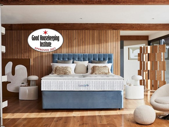
Pictured: Sleepeezee Pocket Gel Posie 3200 Mattress and Divan Bed
Get the balance right with the 60-30-10 rule
60-30-10 is a tried and true decorating rule professional interior designers use to pick balanced colour schemes. Here’s how it works:
- 60 refers to your primary bedroom colour. The idea is that 60% of the colours in your bedroom will be the same. This is your backdrop colour, so neutral hues like grey, white, cream, and pastel are perfect.
- 30 refers to your secondary colour. 30% of the colour in your bedroom will be this colour, so it has to compliment the primary colour. Your secondary colour should be different enough to stand out but not so diverse that it ‘pops’.
- 10 refers to your accent colour or feature colour. Your accent colour should pop, giving your bedroom a welcome touch of individuality. Features in your bedroom like cushions and throws should be this colour.
Here’s an example colour scheme:
- Primary colour: Bamboo
- Secondary colour: Nordic Grey
- Accent colour: Midnight Blue
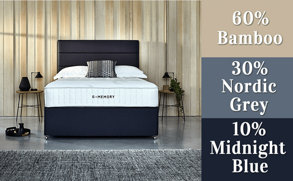
Pictured: Midnight blue divan bed with G-memory Sleepezze Mattress, Available from Bedstar The Online Bed Superstore.
Remain true to your measurements when choosing a new bed. The 60 30 10 Formula is always a good idea.
The idea is to balance complementary colours, but the colours don’t have to be different; you can also use different shades of the same colour.
Fitting furniture into the mix
When picking a relaxing colour scheme for your bedroom, you have a decision to make about furniture. It can blend in with your primary and secondary colours or stand out and compliment your accent colour.
Unless you are designing a kid’s bedroom where colourful furniture is all the rage, we recommend furniture that blends in. A natural bed in wood is a timeless choice, or you can go for a metal bed in grey or black.
The rule of thumb with bedroom furniture is to make sure it all colour matches, or else your bedroom will look disjointed and thrown together. So, if your bed is white, get a white wardrobe and a white chest of drawers to match.
By matching furniture and making sure it complements your colour scheme, you’ll create a balanced, structured space that soothes your mind.